River Avenue Blues

  • About
    • Privacy Policy
  • Features
    • Yankees Top 30 Prospects
    • Prospect Profiles
    • Fan Confidence
  • Resources
    • 2019 Draft Order
    • Depth Chart
    • Bullpen Workload
    • Guide to Stats
  • Shop and Tickets
    • RAB Tickets
    • MLB Shop
    • Fanatics
    • Amazon
    • Steiner Sports Memorabilia
River Ave. Blues ยป The stats we use

The Stats We Use: OPS+, wRC+, and ERA+

March 25, 2010 by Joe Pawlikowski 39 Comments

In previous installments of this series we’ve covered the basic offensive, defensive, and pitching stats we use when discussing player production. Those familiar with the statistics will recognize what it means when we say a player has a .355 wOBA. Those who aren’t, though, might have a bit of trouble determining exactly what that means, even if they’re familiar with the workings of the statistic. To make things easier, we have a number of stats which compare production to the league average. We’ll dive into these today.

OPS+

Baseball Reference has changed the way we view statistics. The site makes everything presentable and easy to access, so we can look up our favorite players and see exactly what they did. One statistic that B-R founder Sean Forman created was OPS+. OPS, as you likely already know, stands for On-Base Plus Slugging. Since the ability to get on base and the ability to hit for power represent two of the most important things a batter can do, mashing the two stats together made enough sense, even if it double-counts singles — not to mention combines two stats that have different denominators.

The other problem with OPS is that it deals with two statistics on different scales. The maximum OBP is 1.000, while the maximum SLG is 4.000. The answer, then, is to weight the statistics when combining. Forman went with (1.2*OPB) + SLG, and then placed that figure on a scale where 100 was league average. That made the stat easier to understand. Instead of having just a number, OPS+ put the number in context by comparing it to everyone else in the league. Now we know that when a player has a 120 OPS+ that he’s well above league average. We might not have been able to discern that by just seeing a, for example, .870 OPS by itself.

Improved as it may be, OPS+ is not perfect. For instance, Tom Tango believes that OPS+ still undervalues OBP, and that the calculation should be (1.8*OBP) + SLG. Even so, OPS+ is an improvement over straight OPS, not just because of the 1.2*OBP calculation, but also because of how easily it tells us what we want to know. But, perhaps there’s a better stat for this.

wRC+

Uh oh. Another stat with a lower-case letter. For some this might mean trouble. It’s not, though. In fact, it works right along with wOBA to provide us with a scaled view of player production.

The story of wRC+ doesn’t go back too far. In December Alex Remington wrote a wOBA primer, and Tango made a comment about one of Alex’s lines regarding wOBA in relation to OPS and OPS+. Later, in the comments, Tango said that he did not want wOBA+, but rather wRC+ — weighted Runs Created on a league scale. He used the BaseRuns formula to demonstrate how easy it would be to implement, and FanGraphs proprietor David Appelman (a great guy, really!) implemented it. The whole process took about a day. No joke.

The basics of wRC+ can be found in the wOBA primer. It uses the same system, basically, but instead of outputting a rate stat it outputs a counting stat, weighted Runs Created, or wRC. The number is park adjusted and scaled to the league. Like OPS+, 100 is league average. I prefer wRC+ to OPS+ not only because of the slight flaw in the OPS+ calculation, but because it assigns a proper value to each component, whereas OPS+ still uses the arbitrary measures of two for a double, three for a triple, etc.

ERA+

Like OPS+, ERA+ can be found at Baseball-Reference. This one won’t take but a paragraph to explain. Like OPS+, ERA+ is on a scale where 100 is league average. You can compute it right from home, too. Just take two minus the player ERA divided by the league ERA and multiple by 100. In other words: 100 * (2 – playerERA/leagueERA).* That’s literally it. The advantage, of course, is that you can determine how much better than average a pitcher was, no matter what the run environment.

* They did change ERA+ just yesterday. It produces the same results, in that the players are ranked the same. The formula change just makes ERA+ linear. That is, a player with a 122 ERA+ is 22 percent better than league average. The old way didn’t handle it like this. Sean Forman, proprietor of Baseball Reference, explains: “With the new formula, the equation is linear, so if the league ERA is 4.50 and you have one pitcher at 3.50, one at 3.00 and one at 2.50 you get ERA+’s of 122, 133 and one at 144 (one is 22% better than the league, one is 33%, and one is 44% better). It seems to me the numbers make a little more sense this way.”

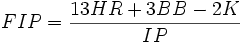
I’d like to see this expanded to FIP. It shouldn’t be hard to create FIP+, and I do wonder sometimes why it’s not a readily available stat. Probably because FIP stands fine by its own, since it’s not really based on the same value scale as ERA. Still, I do like the concept of adding context by scaling to 100. It gives us a one-glance idea of how a player performs compared to his peers.

Next up

There will be one or two more posts in this series, touching on some other offensive and pitching measures. The ones in the series so far, though, are the ones we’ll primarily use.

Filed Under: Administrative Stuff Tagged With: The stats we use

The stats we use: WPA and LI

February 11, 2010 by Joe Pawlikowski 24 Comments

Now that we have discussed our favorites among defensive, offensive, and pitching stats, we’re going to move onto a more general one. Today I’m going to explain Win Probability Added, or WPA, and Leverage Index, or LI. Both are pretty simple concepts, but we use them enough on RAB that I’d like to add it to our stats guide.

Quick terms

I like the term WPA, because it accurately describes what the stat tells. You’ll also see me talk about WE, or Win Expectancy. Put simply, WE represents a team’s chances of winning at any point in the game, and WPA represents the play-by-play swing in WE.

Calculating win expectancy

It’s the bottom of the fifth, two outs, runners on first and third, home team down by one. What are the chances of the home team winning that game? Thanks to the abundance of freely available data, we can pore through historical records and find out. (Where would we be without Retrosheet?) With over 70,000 games played since 1977, we have plenty of data to draw from.

The answer to the above question, according to Walk Off Balk’s Win Expectancy Finder, is that the home team won 42.9 percent of the time. If the batter singled in the runner from third, tying the score and placing runners on first and second with two out, the home team’s win expectancy rises to 57.1 percent, or a 7.9 percent swing. When we calculate Win Probability Added, the hitter gets credited with .079, and the pitcher gets debited.

As we’ll see in a second, however, this particular Win Expectancy Finder contains certain flaws.

Stripping out bias

I first started following WPA in 2005 when I wrote some blog that no one read. To calculate it I used Dave Studeman’s WPA spreadsheet, which was based on the Win Expectancy Finder. All I had to do was input the game’s play-by-play results, and the spreadsheet would track WPA throughout the game, assigning blame and credit to pitchers and hitters, and in the end creating a neat graph. It seemed like the perfect implementation.

Then, when RAB started in 2007, I discovered FanGraphs. They tracked the Win Expectancy of all games, basically doing the job the spreadsheet did. Since I had switched to a Mac that winter, and since Studes’s spreadsheet didn’t work on Excel 2003 for Mac, I found this a viable solution. Yet there are differences in how FanGraphs calculates Win Expectancy and how the WE Finder does.

The biggest difference between the two is run environment. Some years teams score more runs than others. I’m not sure if the WE Finder adjusts for this, depending on the year range you select, but FanGraphs does. The site uses the most up-to-date Win Expectancy tables, while the WE Finder runs only through the 2006 season. Those all help the accuracy of FanGraphs’s WPA measures.

The final aspect might seem a bit controversial to some, but it’s really not. In the WE Finder, the game begins already slanted to the home team. Since home teams won 54 percent of games between 1977 and 2006, the game starts with the home team having 0.540 WE. That means if they put up a scoreless first, they have a nearly 60 percent WE when coming to bat. This might make sense at first, but after further examination I prefer the FanGraphs method, where the WE starts at 50 percent.

The main question people ask upon hearing this is, “If a home team wins 54 percent of the time, shouldn’t we take that into account?” If we take that into account, however, where do we stop? We know that Johan Santana wins a certain percentage of his games. Why not adjust WPA at the start of the game to reflect this? Why not adjust for day and night games? Weekday and weekend? There are so many pre-game factors involved that it’s best to strip all bias and start everyone on equal footing.

What about those weird graphs?

Above is the WPA graph for World Series Game 6. Pretty boring, eh? If that were a normal game in June, we wouldn’t much care for it. Unfortunately, the WPA graph doesn’t adjust for the home team’s fans’ excitement.

The graph is relatively self-explanatory. The green line tracks the WE as the game goes along. As it draws closer to the bottom, the visiting team has the advantage. As it draws closer to the top, the home team has the advantage.

For a more interesting WPA graph:

Next up: what’s that bar graph at the bottom?

Leverage Index

The concept of clutch hitting has permeated baseball since its inception. Some players rise to the occasion, while others don’t. Until LI, we had no real way of measuring clutch ability. We just worked off anecdotal evidence of of writers and fans touting some players while eviscerating others. With Leverage Index, though, we can determine just how important a situation is, and then how players performed in those situations.

A situation with a LI of 1 is considered average. The higher the number, the more crucial the situation. If the number falls below one, it is considered a relatively unimportant situation. Leverage index considers the base, out, and score situation, so at-bats in the ninth inning of a one-run game will count for much more than a comparable situation in the third.

For example, if the home team has the bases loaded with two outs in the bottom of the second , down by one run, the LI in that situation is 3.1. The same situation, but in the bottom of the ninth, yields the highest possible LI, 10.9. You can find a full chart of LI by inning/base/out situation in the resources section.

Any questions?

This is the toughest statistic for me explain, because I’m so familiar with it. I’ve been using and examining WPA for almost five years now, so what seem self-evident to me might not to others. Make sure to ask any questions in the comments, or email them to me. I’m more than willing to edit this guide so it’s as accurate and comprehensive as possible when we create our full guide.

Resources

The One About Win Probability
Get to Know: Leverage Index
Crucial Situations: Part 1, Part 2, Part 3
Leverage Index table
Win Expectancy Finder

Filed Under: Analysis Tagged With: The stats we use

The stats we use: FIP

February 5, 2010 by Joe Pawlikowski 138 Comments

In previous editions of this series we’ve discussed UZR, a defensive statistic, and wOBA, an offensive one. Today we’ll move onto a pitching one. It won’t be the only pitching one we’ll discuss, just as wOBA won’t be the only offensive one. To the best of my abilities, here’s an explanation of Fielding Independent Pitching, or FIP.

Understanding DIPS

The roots of FIP extend back to 2001. In Baseball Prospectus’s annual book, Voros McCracken presented the case that pitchers have little to no control over what happens to balls put in play. The article itself is pretty easy to understand, so if you have a spare five minutes I suggest giving it a read. If not, I’ll provide the most important of McCracken’s findings.

He looked at how hits per balls in play fluctuated from year to year, and found that “pitchers who are the best at preventing hits on balls in play one year are often the worst at it in the next.” He then cites Greg Maddux, who had a poor rate of hits on balls in play in 1999, but was among the best in 1998. Pedro Martinez saw a similar trend, performing horribly in 1999 and excellently in 2000 on balls in play.

You can see for yourself. Here’s Pedro’s BABIP in 2000, .253, tops in the majors, and here’s his BABIP in 1999, third worst among qualifying starters. You can see Greg Maddux on that list as well, seventh worst among qualifying pitchers, while he finished sixth best in 1999. So if pitchers as prolific as Maddux and Martinez can go from among the best to among the worst in the span of one season, it should say something about the nature of a pitcher’s ability to control the outcome of balls put in play.

So what does a pitcher have control over? Tom Tango lists it in a spectrum, from 100 percent pitching to 100 percent fielding. On the 100 percent, or near-100 percent, pitching side: balks, pick-offs, HBP, K, BB, HR. Then there’s a gray area, where it’s partly the pitcher, partly the fielding, though tough to determine which. These outcomes include wild pitches, stolen bases, caught stealings, singles, doubles, triples, batting outs, and passed balls. On the 100 percent fielding side are running outs. The focus of FIP, then, is on the 100 percent pitching part of the spectrum.

Weighing homers, walks, and strikeouts

In our wOBA and UZR primers, we talked about linear run estimators. As a one-sentence recap, linear run estimators put a value on outcomes based on how they contribute to actual run scoring, based on years of historical data. In order to weigh home runs and walks as negative outcomes, and strikeouts as positives, we need to use the linear run estimators to create a ratio, so that we properly weigh the value of each. For those who don’t want to see formulas, skip to the next section. For those who want to see the actual numbers, here goes.

Why the 13:3:2 ratio? We need look no further than the linear run estimator. That’s the ratio of value between homers, walks, and strikeouts.

Scaling it to ERA

One attractive quality of many new statistics is that they scale to existing stats. That makes it easier for us to transition. Looking at raw wOBA, for instance, you might not be able to immediately recognize how good a player performed. But, because it’s scaled to OBP, we can look at the number with a sense of familiarity. It runs along the same scale, so if we know that a hitter with a .335 OBP is near league average, we can assume the same of a player with a .335 wOBA. Except, of course, that wOBA tells us more than OBP by itself.

To align to ERA, we simply add 3.2 to the FIP. That number can apparently fluctuate sometimes — I’ve seen Tango mention adding 3.1 as recently as 2008. But more recently he’s gone with the 3.2 number.

A note on xFIP

In browsing stats on sites like FanGraphs. you might notice a stat called xFIP. This takes the idea of pitcher control a bit further, positing that in addition to having little control over outcomes on balls in play, pitchers have little control over the rate at which their fly balls go for home runs. So, to normalize for this variance, xFIP looks at the number of outfield flies hit off the pitcher, and takes 11 percent of that, which is the league average percentage of fly balls hit for home runs. The equation remains the same.

The reason I like this is because pitcher see more consistency in their year-to-year strikeouts and walks than home runs. There’s still some year-to-year correlation with home runs, but just not as strong. Is that enough to warrant a further normalization? That’s for you to decide. Chances are, however, that we’ll stick to just FIP here when talking about the things pitchers do.

It’s not all about luck

A common misconception is that FIP treats outcomes on balls in play as luck. This is not true. As explained above, outcomes on balls in play represent a gray area, where we don’t know how to what degree the pitcher and fielders are responsible. FIP just strips those plays out of the equation. See the section below for further elaboration.

A good way to think about this is how Tango put it. What we want is ERA to equal FIP plus fielding dependent pitching, plus fielding, plus luck — therefore luck is just one component stripped out of FIP. There are two other components stripped out as well, both of which are probably more important than luck.

Remember: it tells us one thing

The more important thing to note about FIP is exactly what it tells us. It does not make claims about luck, per se. What it tells us is how a pitcher fared on events that were close to 100 percent in his control. Since we know that factors like luck and defense play into ERA, it’s valuable to know how a pitcher does in terms of events for which he’s solely responsible.

Later in the series we’ll get to tRA, which considers batted ball type, and SIERA, Baseball Prospectus’s take on the matter, which will be revealed in the upcoming Baseball Prospectus 2010.

Resources

The original DIPS article
Defensive Responsibility Spectrum
Tango elaborates on FIP

Filed Under: Pitching Tagged With: The stats we use

The stats we use: wOBA

January 21, 2010 by Joe Pawlikowski 3 Comments

Just because people term a statistic “advanced” doesn’t mean it requires an overly complex calculation. Last week we examined UZR, and that might have given off the wrong impression. UZR is complex out of necessity. A baseball field contains 78 zones, and to calculate defense we must account for multiple zones per player. This involves not only balls hit into the zones, but also the type of ball hit into the zones and the rate at which other players converted those balls into outs. Offensive statistics, however, are a bit more straight forward. It helps, too, that we’re already familiar with the components.

This week we’re going to dive into weighted on base average, or wOBA. Developed by Tom Tango, the stat attempts to reconcile OBP and SLG, two of the most important offensive statistics. They both measure one thing while ignoring others. OBP measures how many times a player reaches base while ignoring the difference between a walk and a home run. SLG measures total bases while ignoring walks. wOBA weighs both and combines them for an offensive statistic that more accurately represents a player’s value.

What about OPS?

At this point you might be saying, “But they already have OPS. That combines OBP and SLG. So what gives?” True, OPS stands for on-base plus slugging, so why the need for a more advanced calculation? The answer deals with the scales upon which each metric is based.

The denominator in OBP is plate appearances, while the denominator in SLG is at-bats. True, they’re expressed in decimal format, and that might make it easier to slap them together. That doesn’t mean it is correct. Beyond the denominator issue, we also have an issue of scale. OBP is almost always going to be lower than SLG, because OBP is binary. You either reached base or you didn’t, meaning you get a 1 if you succeed and a 0 if you fail. SLG, on the other hand, measures total bases, so a player receives 4 for a home run, 3 for a triple, 2 for a double, and 1 for a single. And, again, it works with a smaller denominator, since at-bats is a subset of plate appearances.

By merely adding together OBP and SLG, we get a number that greatly favors power hitters. High on base guys will still climb the OPS charts, but their lack of power will keep them away from the top. What we want an on-base plus slugging stat to accomplish is to properly weigh these two aspects and provide us a proper valuation of offensive contribution.

How do we weigh events?

Instead of working with OBP and SLG, Tango decided to start from scratch with wOBA. This makes perfect sense. Statistics are just a recording of what happened on the field. OBP examines walks, hits, and outs. SLG examines singles and extra base hits. Why take those two pre-made calculations when the available data allows you to weigh the individual components of these stats before their OBP and SLG calculations? That’s exactly what Tango did.

In last week’s UZR primer, we looked at linear run estimators, which assigns a certain run value to each offensive event. This comes into play again for wOBA. After breaking offense down into its individual components, we can then weigh the value of those components and combine them for a rate stat. With wOBA, however, we’re looking at the runs above the run value of an out, which is zero in an OBP calculation. So here’s an updated linear run estimator, in terms of runs above the value of an out.

Event Value
Single 0.77
Double 1.08
Triple 1.37
Home run 1.70
Walk 0.62

The only step left is to scale the stat to OBP. This isn’t necessary — in fact, the league-average hitter under this situation would be around .300, which seems like a neat, round number. But, since we’re talking about a weighted OBP, Tango decided to scale it so the league average is around .340. That requires adding 15 percent to each weight. Again, not a big deal. It just makes the end result easier to understand.

Stolen bases

Yes, wOBA includes stolen bases. Successful stolen bases weigh at 0.20, while a caught stealing around -0.44. Tango provides a full list of linear weight events here.

Runs above average

Using wOBA, we can easily determine how many runs above average a player contributed. All we have to do is subtract the league-average wOBA from the player’s wOBA. But, because of the 15 percent weight added for scale, we need to divide by 1.15 to strip that out.

No adjustments?

No, there is no wOBA adjustment for park, position, or league. Individuals can make these calculations, but wOBA is meant as a context-neutral stat. Again, just as OPB and SLG are not park adjusted, nor is wOBA.

What about OPS+?

On Big League Stew, Alex Remington is running his own series of articles on advanced statistics. I try not to use what he writes in mine, especially because we’re trying for different purposes. In his wOBA primer he makes a statement with which Tango takes issue. Alex says that wOBA is “superior to non-weighted stats like OPS and OPS+.” The statement is inaccurate, because OPS+ is weighted. But, as Tango notes, it is weighted improperly.

Sean Forman, proprietor of Baseball Reference, leads the charge with OPS+. He essentially weighs OBP to SLG at a 1.2 to 1 ratio. That appears to improperly undervalue OBP, and Tango argues that the ratio should be more like 1.7 or 1.8 to 1. Because OPS+ does park and league adjust, that would make OPS+, as he says, “(almost always) superior to wOBA.” Again, this comes from the man who created wOBA.

To remember

Unlike all-in-one stats like WAR and WARP3, wOBA doesn’t try to tell us everything. What it does try to tell us is the value of a player’s offensive contribution. It doesn’t necessarily favor guys who walk a lot, like OBP, or guys who hit for a lot of power, like SLG and OPS. It breaks down offense into its core events, weighs those events, and then adds up the value. It also adjusts to a familiar scale, making it easier for us to understand, at a glance, the value of a player’s contribution.

Resources

wOBA from The Book
Getting to know wOBA
The history of wOBA, part 1 (to which there seems to be no part 2)

Filed Under: Offense Tagged With: The stats we use

The stats we use: UZR

January 14, 2010 by Joe Pawlikowski 132 Comments

Have you ever read an article on this site, only to encounter a strange acronym that you don’t understand? For the most part they’re either inside jokes or advanced metrics. The increasing amount of data available makes it easier for us to take raw numbers and put them into context, allowing us the ability to compare players using stats that give us not only numbers, but context. These advanced stats tell us not one thing — OBP, for instance, tells us just one thing and ignores other factors — but many things that go into a player’s value.

Over the next week or so we’ll discuss the most commonly used stats on this site. Many of these require heavy math, and we know that can turn off many people. This series of articles will attempt to explain what goes into these stats without getting into any of the heavy math. We’ll include as many resources as possible, however, in case you want to dive into the calculations yourself. By the end of the series, we’ll replace our woefully outdated and partly inaccurate guide to stats.

[Read more…]

Filed Under: Defense Tagged With: The stats we use

RAB Thoughts on Patreon

Mike is running weekly thoughts-style posts at our "RAB Thoughts" Patreon. $3 per month gets you weekly Yankees analysis. Become a Patron!

Got A Question For The Mailbag?

Email us at RABmailbag (at) gmail (dot) com. The mailbag is posted Friday mornings.

RAB Features

  • 2019 Season Preview series
  • 2019 Top 30 Prospects
  • 'What If' series with OOTP
  • Yankees depth chart

Search RAB

Copyright © 2025 · River Avenue Blues